The ST Mark
Before there was a brand book, there was a teenager with a copy of Paint Shop Pro and a lot of confidence. “Superterran” needed a look — and across the Tripod and early superterran.com years it got several, most of them orbiting a single crosshair-and-globe mark and the letters ST. This exhibit collects the homemade logos and banner ads that promoted the site.
The ST·UT banner
The centerpiece — and the whole reason this exhibit exists — is the banner I made to advertise superterran.com. It is not a designed graphic so much as a screenshot from Unreal Tournament with the URL and a fake scoreboard pasted on top:

“Head shot from the air… Perfect way to end a match.” — with superterran (100) topping the scoreboard, naturally. Web advertising in 2002, by a kid who figured the best way to sell a personal site was to look like you were winning at UT. This is the banner that rode along with the “remixed” splash on superterran.com 2002.
The Superman complex
The other recurring identity was Superterran-as-Superman — the same joke the name itself is making. This banner has Superman tearing his shirt open to reveal not an “S” but an ST crest:
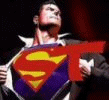
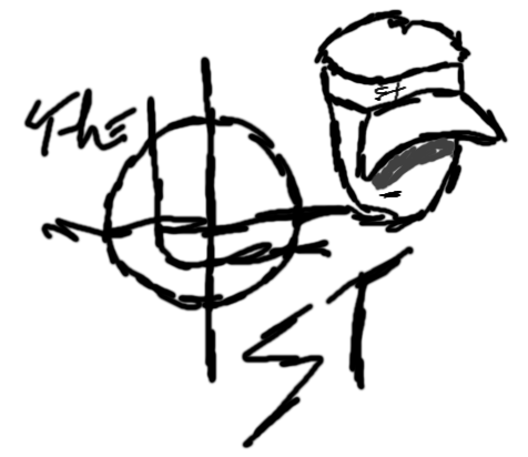
And here is the same idea worked out longhand, in a hand-drawn logo study — the crosshair-globe mark, a ball cap, and “THE ST” in jagged marker:
The crosshair and the splash
The crosshair-and-globe turns up everywhere once you start looking. It was the logo on the Tripod Superterran XP site (orange “xp” and all)…
…and the more polished superterran.com splash leaned on a blue profile-and-globe motif with the wordmark beneath it:
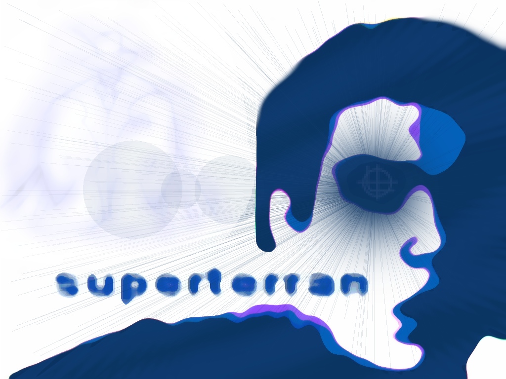
None of it was consistent, none of it was good, and all of it was unmistakably mine. That crosshair logo would outlast most of the designs it sat on.
Honorable mention: Kid Pimp
Running alongside “Superterran” was an alter-ego I have to own up to: KP — “Kid Pimp.” On the under-construction Brawl-Hall.com page, the contact line read “email kp/st (we’re the same person, you know)” — possibly the most 2002 sentence I have ever written.
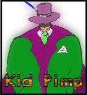
Even the alter-ego couldn’t escape the branding — that’s the ST crosshair right on his lapel. KP left almost no trace online (no surviving deviantART or theme-site account turned up under the name), so he lives on here exactly as he should: an honorable mention.